Start with the guest’s journey
Wayfinding begins before a guest reads a sign. On arrival, people look for a likely entrance, a place to check in and a clear path to the next step. Once inside, they may need to find elevators, their room, breakfast, meeting spaces or an exit. A useful design exercise is to walk each of these journeys as though visiting for the first time, carrying luggage and knowing nothing about the building.
Pay particular attention to decision points: places where a guest must choose between doors, corridors or levels. The route between those points should feel continuous. If the elevators are visible from reception, a guest may need only a brief direction. If they are around a corner, that turn needs a clear cue. The aim is not to fill every wall with information, but to answer each question where it arises.
Make the route understandable before adding signs
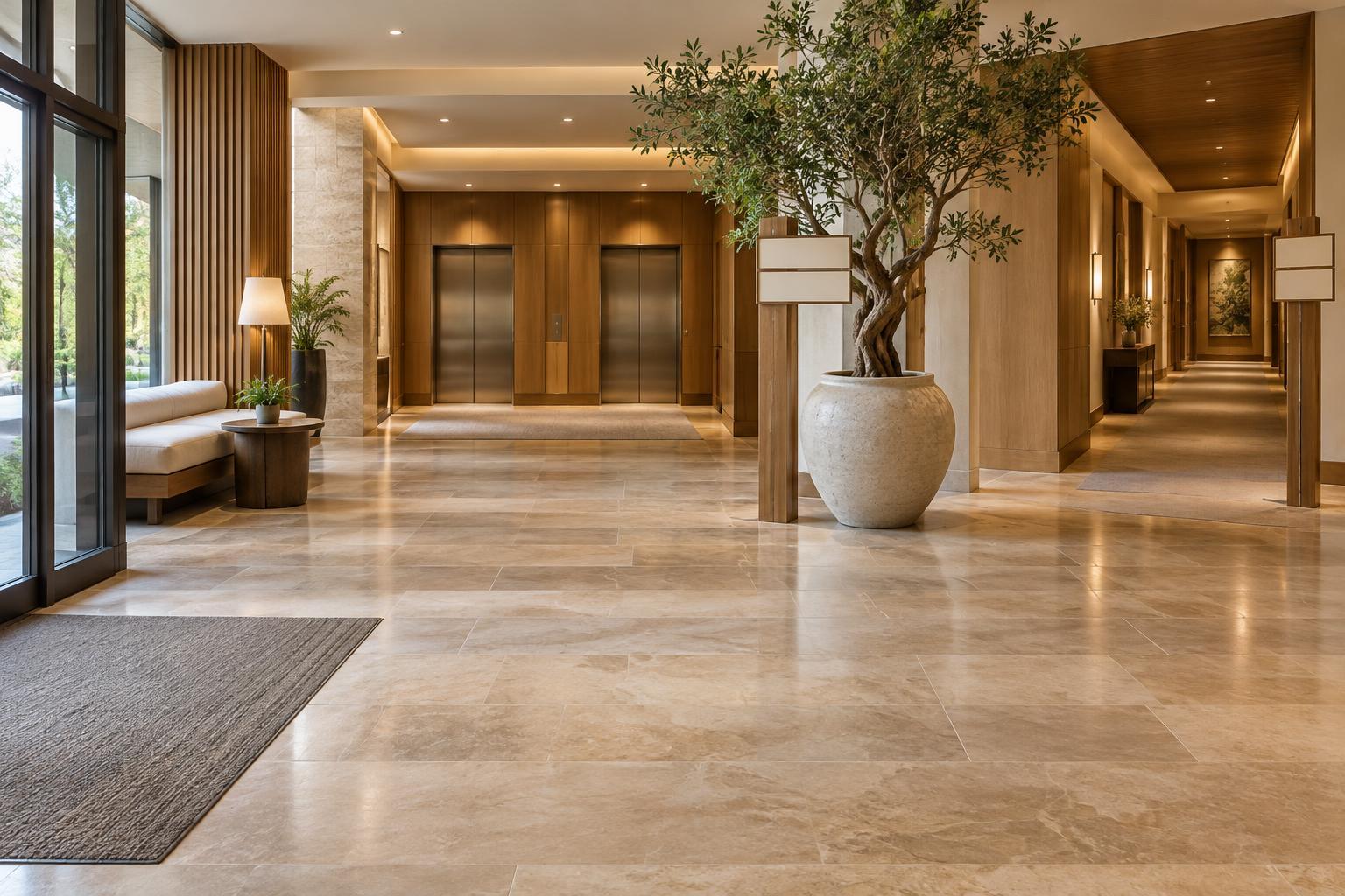
A sign can direct a guest down a confusing corridor, but it cannot make that corridor feel inviting or obvious. Where a layout allows, keep main routes visually open and distinguish them from service areas. Consistent lighting, floor finishes and doorway treatments can reinforce the path from the entrance to reception and onward to guest elevators. Avoid placing furniture, displays or decorative screens where they obscure the next destination.
Differentiate destinations in ways that remain useful throughout the day. A bright window may be a helpful daytime cue but less effective after dark; a distinct wall finish or clearly framed doorway is more dependable. For larger or more complex hotels, repeat a simple organizing idea, such as identifying guest-room wings by name or floor, rather than expecting visitors to decode a new system at every junction.
Put signs where decisions happen
Effective signs match the questions guests actually ask. At the entrance, the priority may be reception and elevators. Near an elevator bank, guests need to know which floors contain rooms or shared facilities. After stepping out of an elevator, they need an immediate indication of room-number ranges and which direction to turn. Room signs should then confirm that they have arrived, rather than serve as the first clue about the numbering scheme.
Use short, consistent names for destinations. Switching between “lobby,” “reception” and “front desk” on different signs can create unnecessary doubt. Keep arrows close to the words they describe, and check that their meaning is unambiguous at corners and stair landings. Readable contrast, legible lettering and lighting matter more than an elaborate graphic style. Symbols can help, but unfamiliar icons should not carry an important direction on their own.
Use landmarks as reassuring cues
Guests often remember a place more easily than a sequence of turns. A distinctive seating area, artwork, color treatment or view can make a route easier to describe and retrace. Landmarks are especially helpful in long corridors that otherwise look alike. They work best when they are visible near a choice point and have a stable location; a movable display is less reliable as a navigation cue.
Landmarks should support the sign system, not compete with it. If staff say, “Turn left at the blue lounge,” guests should also find a directional sign at that turn. Choose features that fit the hotel’s character while remaining distinguishable from nearby spaces. A consistent palette across the property can feel cohesive, but a few carefully varied features give guests useful reference points.
Check accessibility and keep the system current
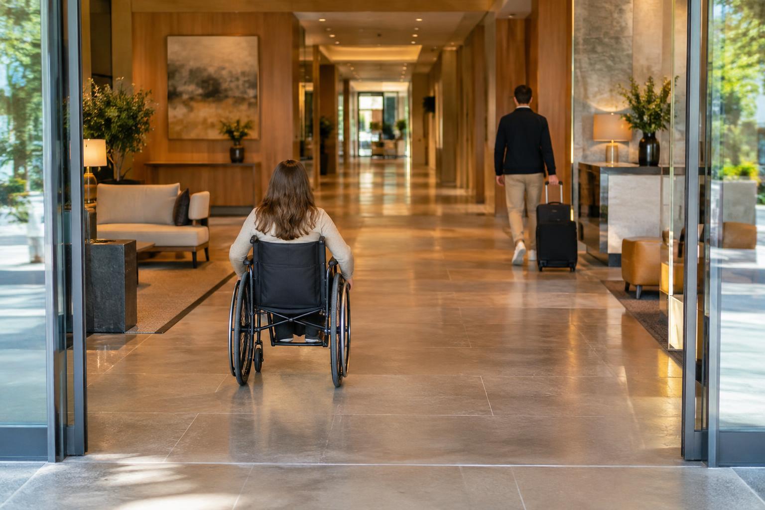
A navigable hotel should work for more than one kind of visitor. Consider guests using mobility aids, guests with limited vision, people who do not know the local language and anyone moving through the building while tired or distracted. Check whether accessible routes are as clear as the most direct routes, including where a lift or alternative entrance is needed. Sign placement, lighting and visual contrast should be reviewed in the spaces where guests will actually encounter them, with applicable accessibility requirements checked during design.
Wayfinding also needs routine attention after opening. Temporary event signs, plants and luggage carts can hide permanent directions. A renamed restaurant or relocated breakfast room can make an otherwise sound system misleading. Ask staff which directions they repeat most often, and walk common guest routes after any layout or service change. Repeated questions at the same spot may point to a missing cue, a poorly placed sign or a route that needs to be made clearer.