Start with the experience, not a paint chip
Color is often discussed as a mood setter, but in a hotel it also has a practical job. Guests encounter it while looking for reception, waiting for a lift, entering a room and finding a place to sit. A coherent palette gives those moments a recognizable connection, even when the spaces serve different purposes.
Before choosing finishes, describe the experience the property aims to offer in a few ordinary words: calm and residential, lively and social, or quiet and refined, for example. Then look at the building itself. Daylight, ceiling height, existing floors and architectural details may suggest colors worth keeping. A palette that works with these features is usually easier to carry through the hotel than one chosen from a single inspiration image.
Give each color a clear role
A useful palette has a small set of roles rather than an identical formula for every room. A background color can connect large surfaces such as walls. A supporting color can appear in upholstery, curtains or joinery. An accent can draw attention to selected features. Materials such as wood, stone and metal also contribute color, so include them when judging the whole scheme.
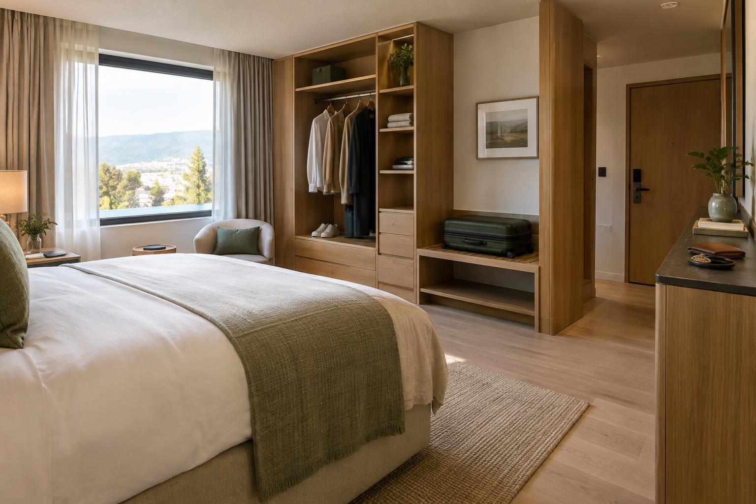
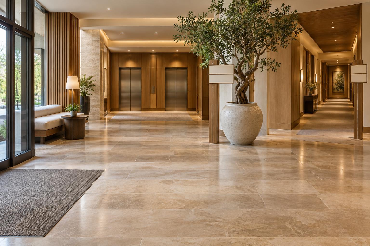
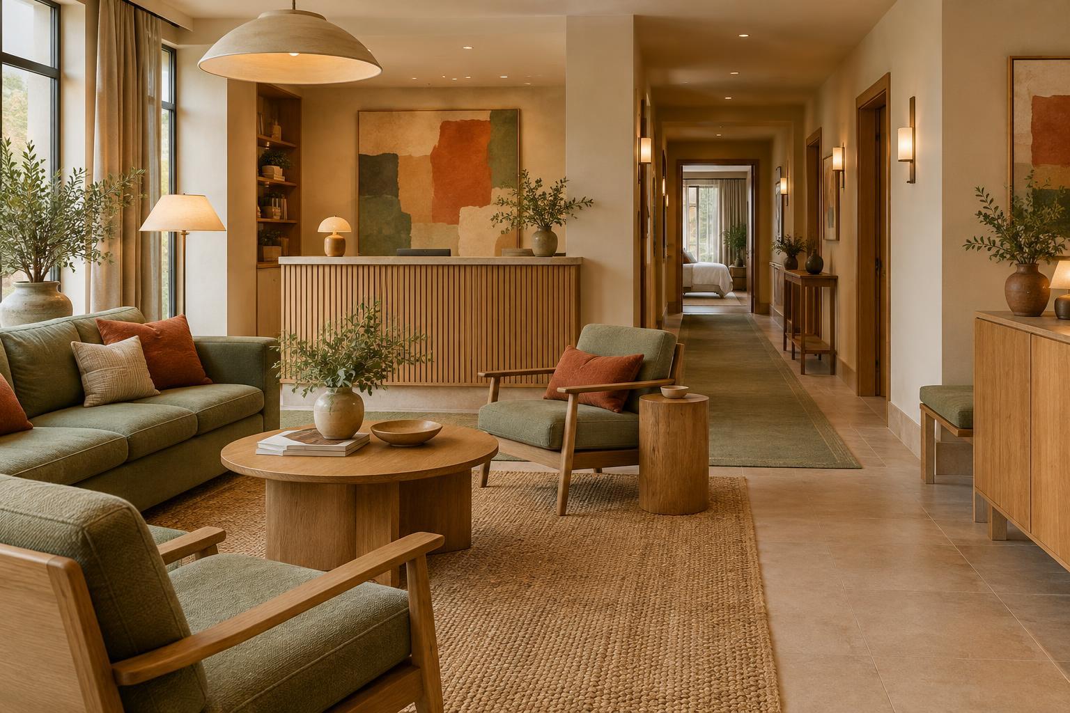
Think of repetition as a thread, not a rule that every space must match. A warm neutral from the lobby might return on guest-room walls, while a deeper accent moves from a lobby chair to a bedside textile or piece of art. The restaurant can use a richer version of the same family to suit its atmosphere. This approach creates recognition while allowing each area to have its own character.
Let function guide variation
Color can help distinguish spaces without breaking the overall scheme. A lobby may need enough visual energy to feel welcoming and enough clarity to make the reception desk easy to find. Corridors often benefit from a steady background, with changes at lift lobbies or junctions to help guests orient themselves. Guest rooms can carry the palette more softly, leaving room for rest and for guests' belongings.
Do not rely on color alone to communicate essential information. Signs, room numbers, door details and lighting should remain clear for guests who perceive colors differently or are moving through the building in low light. Check that text and important controls stand out from their backgrounds. An attractive accent wall is less useful if it makes a door, switch or directional sign harder to notice.
Test colors where guests will see them
A color can change noticeably between a sample card and a finished room. View larger samples beside the actual floor, furniture and fabrics, and check them under daylight and the lighting planned for the space. A shade that feels gentle beside a window may appear dull in a corridor; a bright accent may become overwhelming across an entire wall.
Where possible, test a small combination rather than one color at a time. Place the proposed wall finish, upholstery and timber or metal samples together. Photographing them can help record options, but make the final judgment in person: cameras and screens can shift their appearance. If rooms have very different daylight, they may need slight adjustments to achieve a similar overall feel.
Plan for upkeep and future changes
A hotel palette has to survive daily use. Consider where luggage may brush walls, where spills are likely and which surfaces staff need to clean frequently. The right finish and material can matter as much as the hue. An accent used on a replaceable cushion is easier to update than one built into every fixed surface.
Record the chosen colors and finishes by area so replacements are easier to match. When refreshing a space later, keep a few familiar elements and change others deliberately. Cohesion is not a demand for perfect uniformity; it is the sense that someone has considered how the guest's journey fits together.